Tuesday, January 27, 2015

Putting it All Together - Interior Redesign of the First Floor - January 25 - January 26, 2015

The new floors made the room darker, which was expected since we went from a beige carpet to a dark brown floor. A redesign is definitely in order! Through the years, I have accumulated items that are in the sage and turquoise theme to complement the ivory, dark brown, tan/beige colors of majority of our furnishings. I'd like to continue with the same color scheme; but, I would need to add a few items to make the colors pop more, unify and anchor the space.

A-shopping-we-will-go!

I love shopping at HomeGoods, Kirkland, and Ross, which all have great items to choose from at discounted prices. Most of the items we already own were purchased from HomeGoods and Ross. I just started shopping at Kirkland, where I got my daughter's lamp. More on that later.

I am happy to say that I only needed a handful of items, which I purchased from Ross. I got a turquoise  area rug in Moroccan style to place underneath the coffee table to help anchor and create a separate area for the living room. At $19.99, it was a steal! Then, I found two throw pillows at $7.99 each to complement the rug. I placed one pillow in the middle of the couch and the other one in the middle of the loveseat.  In addition, I got a buffet lamp with silver stem and taupe shade for $19.99 to replace the aqua and beige table lamp that I moved to the family room. I replaced the lampshade of the new lamp with a white with a $5 turquoise lamp shade with graphic design that matched the pillows. All together, they unified the look! So, for less than $86 with taxes, I managed to brighten our living/dining room combo. Below are the photos. I hope you like the transformation just as we do.

Before and after. What a big difference an area rug and a pair of throw pillows make.

Photo shown with the slightly updated layout with the addition of rug, pillows, and new buffet lamp on top of the piano.


Our winter decoration. This shot was taken in December 2014. The same colors remain!


Out with the Builder Carpets! - January 23 - 24, 2015

The good thing about buying a brand new home, you have the flexibility to choose the finishes that you can live with. I say that with a bit of grain of salt because, at least for my family, it's something we can live with until we can afford to upgrade down the road. So, when we were choosing the finishes, we kept the upgrades to the minimum and opted for the builder's standards.

Fortunately, we bought our home when the real estate market was slow. After five years of being in a slump, it was still a buyer's market. To entice people to buy, the builder (Seeno, now known as, Discovery Homes) offered standard finishes that would, otherwise, be upgrades on other communities of new homes. To be honest, this isn't the first time we bought a Seeno home. This is our 3rd Seeno Home, so we know what we were getting into. On our two previous purchases, granite counters were  upgrades. Much to our delight, it isn't in this community. The dark stained cabinetry is also standard, as well as the double extra large stainless undermount sink in the kitchen. To top it off, the builders gave us some incentives when we chose to finance our home with their preferred lender. We opted to spend that money to get upgraded window treatments-- plantation shutters downstairs and white vinyl blinds upstairs,

The standard choices for the floors-- beige carpet and ceramic tiles-- were not too bad. We opted for the darker beige carpets and ceramic tiles that have grayish brown design to match the dark espresso wood stain of the cabinets. We have lived with carpets and tiles in our former home, so we were okay with that. Besides, down the road, we can replace those if and when we decide to.

Flooring Upgrade

Like most folks choosing standard flooring, the budget plays a huge role. Penny-pinching was a necessity in order to not exceed our maximum price point on our new home purchase. We did not want to finance upgrades for 30 years. So, we decided when we have extra money in the future, we will tackle the upgrades.

Plenty of foot traffic had put its toil on our builder-grade standard carpets. We have been contemplating on replacing them; but other, more pressing projects, had to happen first. So, this year, which is two-and-a-half years after we moved in, we decided that it is high time to replace the carpets on the first floor for the living, dining, and family rooms.

The choice-- dark stained handscraped laminate, which looks like the real deal, but cost much less, easier to maintain and, virtually, indestructible. The brand is Accents, color is Montreat Hickory, quiet walk underlayment. We opted for glossy white quarterround trim, but the transition pieces to match the floor.

Accents Montreat Hickory

We chose this finish to give the home a rustic look. It matches our espresso finished cabinetry and contrasts well with the existing ceramic tiles in the kitchen and fireplace surround. A darker, similar finish that of our cabinetry is also available and priced much lower than this option; however, it is too dark and doesn't have the rustic texture we're looking for.

We had them installed Friday-Saturday 1/23-1/24/2015, two days after ordering.

Before Photos:

Living Room/Dining Room - Before with carpets

After Photo:


Living Room/Dining Room After with new laminate floor - 1/24/15


Saturday, January 24, 2015

Staircase Windows Privacy Blinds - April 23, 2014


Another late post!

Originally, we  opted to leave the two windows by the staircase bare because we love the way the natural light brightens up the space, giving it an open airy feel. However, when more houses were built and more people started walking in the neighborhood, privacy became an issue. It wouldn't have been an issue hadn't the windows face the hallway upstairs. It's worse at night when the lights are on-- people could see us walking in our hallway. Not that I particularly walk with my undies all the time, but, I do so on rare occasions such as when I forget to unload my clothes from the dryer.

We even strategically placed three matching vases on the lower window sill; but, to no avail. So, after a couple of years of having exposed staircase windows, we decided it was high time to address the issue. The challenge-- find a type of window covering that would give us enough natural light in the day while providing us privacy all day long. In addition, it has to, somehow, match the other window covers that are on the same side of the house, so that it is aesthetically pleasing to the eyes. Finally, it has to be easy to operate and maintain, which can be challenging to pull off since the windows are high and hard to reach.

The solution-- silhouette window blinds by Levolor. We had similar blinds on one of our former homes, located in South San Francisco. When we bought that house, the previous owners had installed them in the living room/dining room space, where the windows were high. One can operate the silhouette window blinds to open, close, draw up and down by using a wireless remote control.

We contacted Budget Blinds and scheduled an appointment. The following day, the sales agent arrived with a thick binder catalog, which has a plethora of options to choose from. We opted for the white with 2-inch slats to complement the upstairs window blinds.

After we finalized the order, the installation came after a week. Installation took only about half an hour.

We love our new blinds! Now, we can enjoy the natural light that penetrates through the mesh fabric of the blinds, while at night we close the slats completely.

                                                                        Before Photos:

The lower of the two windows is still too high to reach.

The higher of the two windows would be a nightmare to operate.

High windows by the staircase.


Exterior view of the two high windows. The need to match the other windows in terms of type of look of window covering.


After Photos

Levolor silhouette blinds by day...


...and night.


Friday, January 23, 2015

Garage Overhead Storage - January 21, 2015

Bursting at the seams--- are the words that I could think of to describe our garage. Recently, I started researching online for a solution that fits our needs and budget. After comparing prices, we found that SafeRacks from Garage Busters, Inc are the best bang for our bucks. Two 4' x 8' racks with installation and tax is about $680. It took less than half an hour to install these racks. Each can carry up to 600 lbs. So, with two, we have 1,200 lbs!

We will start purging our stuff so that only the ones we have to keep will go up there. This is currently a work in progress. Watch out for an update when we're through.

Believe me, this is just the tip of the iceberg!

Garage Busters, Inc to the rescue!

Less than 30 minutes later,two 4' x 8' racks made by SafeRacks are installed. each rack can carry up to 600 lbs. 

We will purge and start loading up boxes. 


It's still bright and lots of space. Each rack can carry up to 600 lbs. 

Backyard Makeover - August 2012 - December 2014

Before I continue blogging about our home reno projects for 2015, I'd like to share some of the improvements we've done since moving into our clustered sanctuary. When we moved in 2012, we had four dogs, so we needed to tackle the outdoors first to make sure they have a place to roam and do their "deeds". One major drawback of buying a brand new home is the lack of backyard landscaping. There's no place for both humans and canines to enjoy the outdoors. So, we called our friend Julio to help us out.

The first order of business-- the backyard patio. We hired Julio to create a stamped backyard concrete in a color that complements the exterior paint of our home. It's somewhat beige/tan in color. Then, we told him to lay down some grass for our little maltese dog. He then added a secondary gate for the sideyard so that the three bigger dogs cannot just invade the backyard when they do their dirty deeds. My husband added gravel and pavers on the sideyard to serve as their dog run. All of these were done within the first couple of weeks of our move.

After a couple of summers, the grass in the backyard had dried up due in part to faulty sprinklers and the summer heat! To top it off, the drought that had been plaguing California for the past couple of years had us thinking of replacing the grass with gravel. So, in October 2014, we had the grass replaced with gravel and the opposite sideyard and borders covered with gorilla hair. My husband and I then went to Lowes to buy some planters so that we can add ornamental drought tolerant plants. The goal is to have a low-maintenance garden.

Bare backyard July 10, 2012
I apologize for not being able to find a photo of the grass while still green and when it turned brown. Ah, for now, please use your imagination. :(

October 2014. We had green sod, but they died. We replaced the sod with gravel and gorilla hair.
Nov. 4, 2014. Added potted plants.


First Room Redo-- A Home Office by the Lake - January 12-16, 2015


My current  IT job allows me to work from home almost full time; so I need a place where I there is peace and quiet. In our home in Oakley, my home office was on the first floor; however, our current home doesn't have any bedrooms downstairs; so, I chose bedroom number 3, which is located at the back of the house.

It's a typical 10' x 10' square room that has a closet that has a double sliding wooden door. Since we moved, my husband bought me three sets of white plastic (made of PVC) shelving units to put my stuff on. I already have the black coated heavy-duty iron shelving units from our former home's home office, but in no time, the shelving units became overloaded with items, hence, the PVC shelving units.

The PVCs were meant to be temporary, until I find a better solution. We placed them against the wall, adjacent to the two iron shelving units, placed in an "L" shape. it was okay at first, allowing me to put my stuff somewhere. However, they turned into a spot where I just threw in stuff that became an eyesore. For a while, I thought of covering with curtains to hide them, but I would rather move those three PVCs somewhere else so that my office space will have more...well...space!

I decided that enough is enough! It's time to de-clutter big time. I chose the lake/beach theme for this room. I needed a sense of calm to help me tackle my daily, stressful job.

Home Office

Found this wall hanging at HomeGoods. It works well with my lake/beach theme. 


A pair of apothecary jars hold messages, favorite quotes, and bible verses. I call these messages in a jar!

I got this shelf for $10 at Ross a couple of years ago. The three starfishes are holiday ornaments from Target purchased 8 years ago.

Organizing our bills and budget.

Coordinating bins to hold magazines and other items.

The trio of plastic baskets are from Dollar Store. They hold the electronics, accessories, and small office supplies such as paper clips, tapes, stapler, labels, etc. The boxes on the bottom shelves were just ordinary filing boxes that I covered with contact paper left over from our kitchen shelves in Oakley. It's a great way to match the color scheme using inexpensive materials.


Designing Our New Space - July 2012 thru December 2014


To those that know me, know that I love to decorate! Check out my other blog Vineyard Living, where I blogged about our former home in Oakley. I also write for Demand Studios-- eHow, Modern Mom, etc. I also used to be an Interior Decorating and Home Improvement contributor for Yahoo! Voices. Both my blogging and article submissions took a backseat in 2011 when my daughter, husband and I started our homebased baking business-- read more about it at JessiCakes Project. With a full time job and baking on the side, I had little time left to write. Those are reasons why I also couldn't update this blog sooner! So, after four years, I am back! I will update all my major blogs as often as I possibly can.

Like I stated on my previous post, our builder-cookie cutter-home was a blank canvas. Here are some of the photos of how we decorated it in the past 2 1/2 years. Can you guess what my favorite color is? You got it-- turquoise! Anything with teal, sage, or very light green work as well.
I forgot to mention that our builders gave us the window coverings free of charge because we use their preferred lender. The first floor got the 3-inch slats vinyl window shutters with matching double sliding doors in the kitchen/dinette area. On second floor, we opted for the 2-inch slats white vinyl window blinds. We would have wanted to go with shutters all the way, but they are so expensive that the $6,000 credit would not be enough.

This year, we are doing some home improvements. Stay tuned for our updates here. Later...j ;-)

Dining Room


Dining Room (Buffet Console)


Living Room (side table vignette)

Living Room and Dining Room Combo

Piano

Kitchen (My husband loves to collect chef themed accessories)

Another corner of the kitchen with a chef.

Kitchen. The window overlooks the backyard. It gets lots of natural light!

Added a side-by-side stainless steel refrigerator by Samsung. We placed a table that expands using the removable leaves to sit 8 - 10 people.


Blank Canvas - July 2012


One thing about builder homes, they are like cookie cutters. Depending on the models, they all look alike.

Finished Front Facade


We knew when we were choosing the materials for the interiors that we would stay with the standards on majority of the finishes and choose our upgrades wisely. We were on a tight budget, so we already thought of areas will would update.  Fortunately, the kitchen comes with two choices of granite colors -- beige and greenish black uba-tuba-- that are standard for this community. We chose the uba-tuba because we have had a bad experience with the lighter beige granite with staining. Also, the greenish black looks sleeker, even with the espresso colored wood cabinets. We opted to upgrade the appliances to stainless steel. We could have kept it black had it been the standard as what the salesperson stated originally, but at the design showroom, they told us that the white appliances are the standard not the black. So, since we were paying extras whether we choose the black or stainless steel, we opted for the latter and paid a couple of hundred dollars more than the black, totaling $600 additional upgrade costs. It was a great choice that we know can help sell the home should we decide to in the future.
Kitchen
 As for the floors, we stayed with the builder's standard beige carpets and beige 12" x 12" ceramic tiles for the kitchen, entryway, laundry, and bathrooms. We had to pay extra to put tiles in the secondary bathroom, powder room, and laundry area, which would have been in linoleum. The choices were pretty decent. We chose the tiles that had some grayish design on them to compliment the cabinets and counters.
Loft
The loft near the stairway is bright and airy. We plan to use it as an entertainment/game room. As you can see from the photo, the railings are basic wood painted in white; however, the top of the spindles matched the standard espresso cabinets.
Dining Room
There is no separate formal dining room, which is okay. The "not-so-formal" living and dining rooms are combined. You walked into this combo as soon as you enter the front door.

Family Room
There is a separate family room that has a corner fireplace. The surround is made of tiles that match the floor tiles.

All the four bedrooms, full bathrooms, and laundry room are upstairs. My daughter is using the second bedroom, which is closest to the master bedroom.  I am using the 3rd bedroom as my home office. Right now, the 4th bedroom is a "storage" room. I plan to turn it into a hobby room. There is a powder room downstairs near the dining room, right off the garage side door.

The house is a blank canvas, waiting to be decorated when we first moved in. On my next post is how it looks like right now!


Flashback - Building Progress - April thru May 2012


 I know it is almost three years late, but for posterity, I am rewinding back the hands of time to upload photos from when the house was being built until we moved in. Then, I will post the progress of all our home improvement projects!

Sorry for the flashbacks, but you'll appreciate the new look when you look back to the old photos.

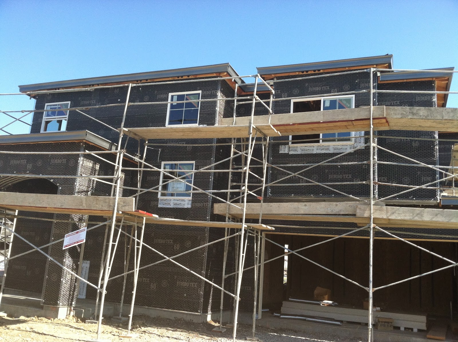
We chose the biggest plan in this community. The model name is Egret, which per builder's measurement is 2,368 sqft; however, when we had it appraised, it was measured and recorded at 2,409 sqft.
Egret Model Floor Plan


The concrete slab foundation is already dry. This is the day we bought it. April 30, 2012

Concrete slab foundation. April 30, 2012

Start of framing! These guys work fast. May 1, 2012

Crew in action. May 12, 2012

Side view


Front view

Front view


Framed and sheetrocks - May 19, 2012

Family room area with corner fireplace -May 19, 2012

Kitchen - May 19, 2012

Kitchen area where the ref will go. You can see the front door and living/dining room combo from this angle. May 19, 2012

Front facade with 2-car side-by-side garage - May 19, 2012